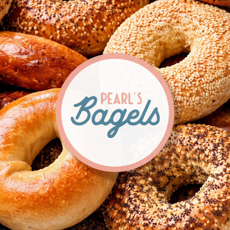
Brookfield x Pearl’s Bagels — Brunch on Brookfield
category:
Branding
services:
Marketing, Design
date:
April 13, 2023
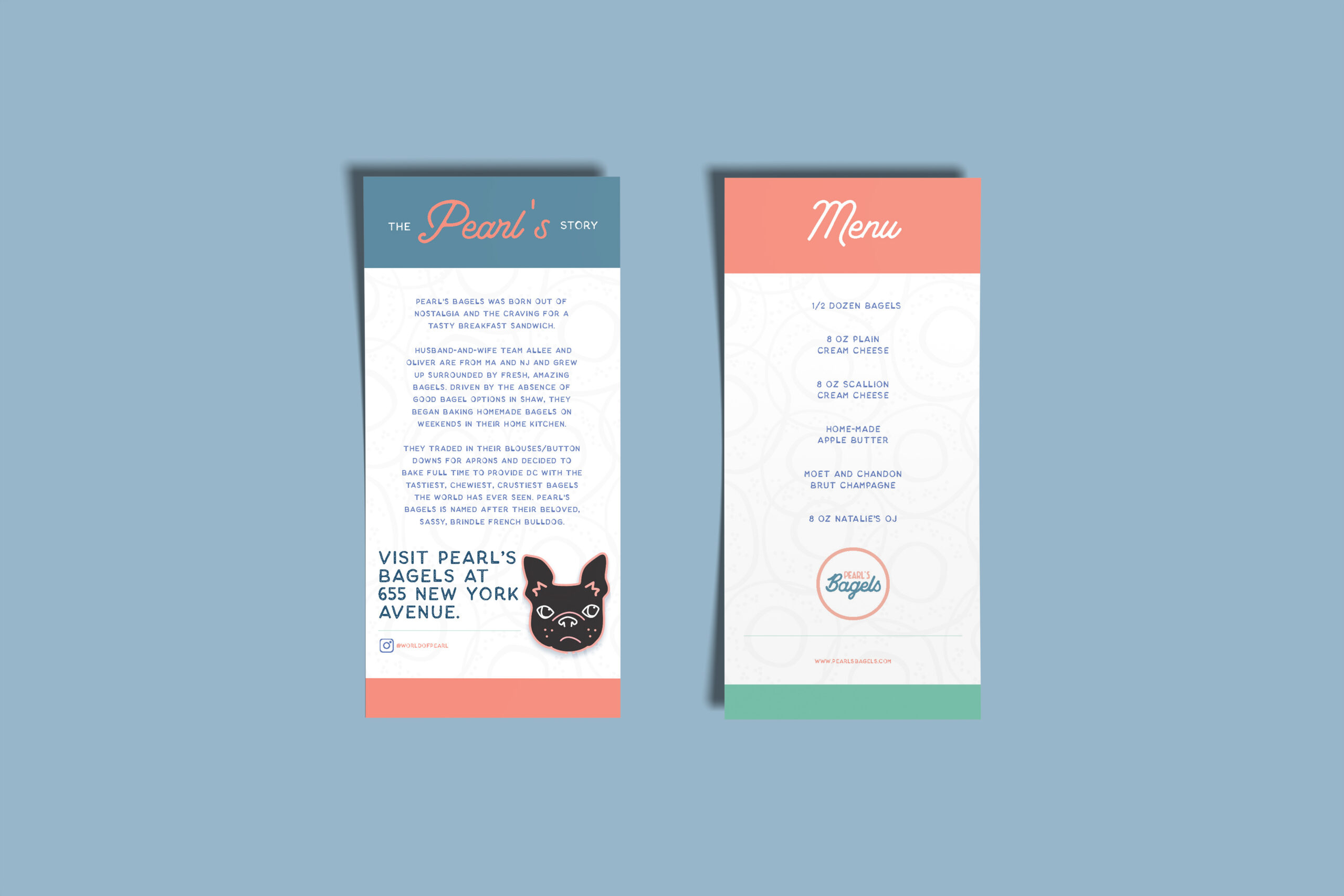
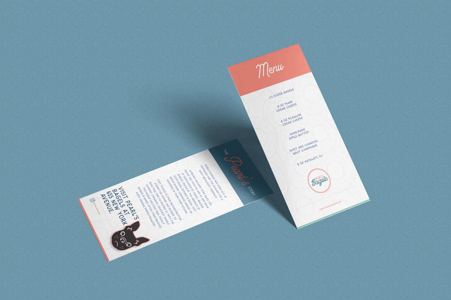
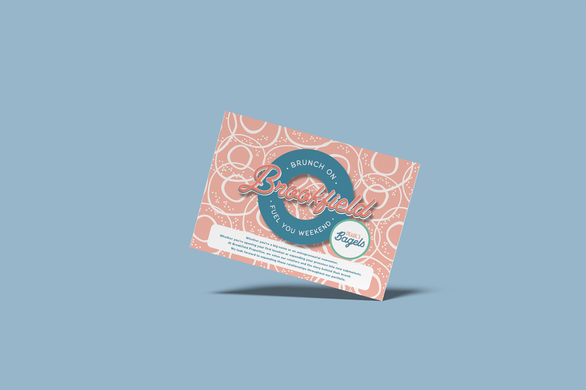
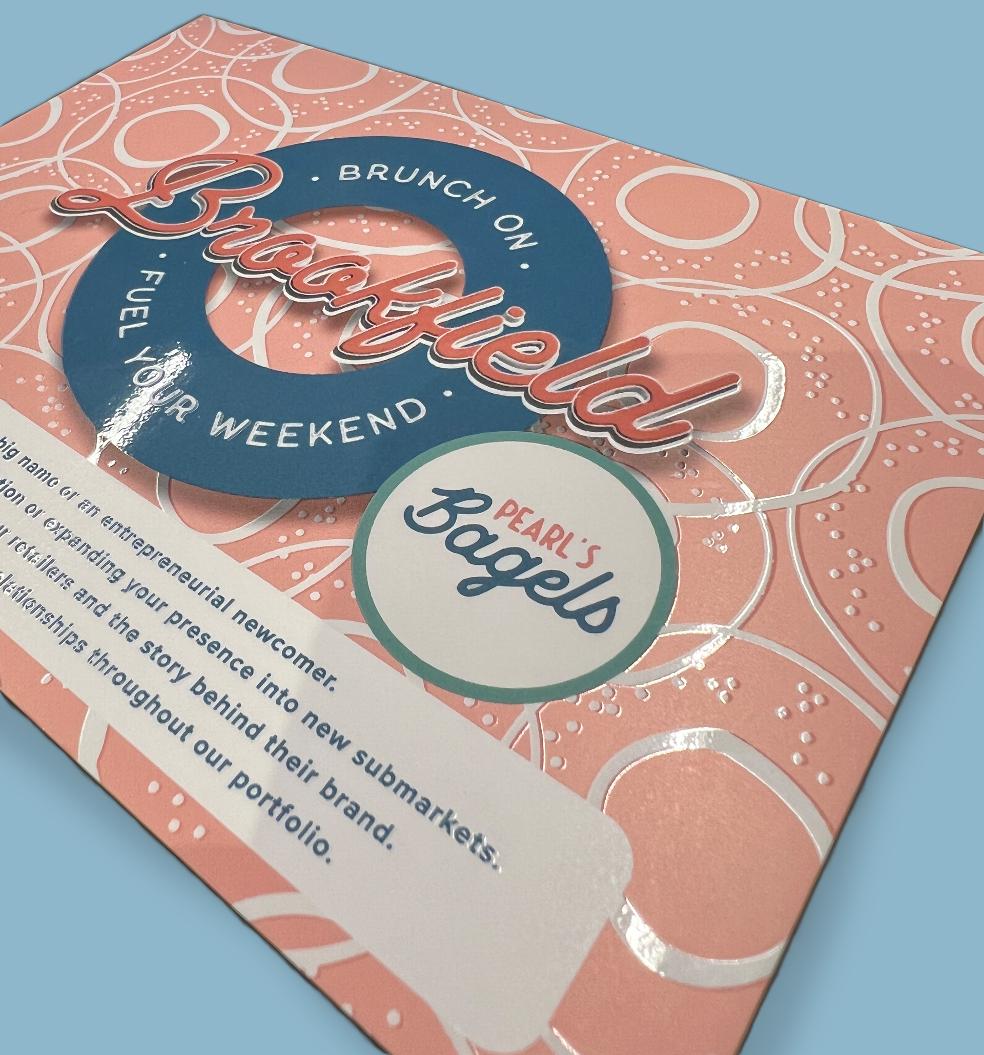
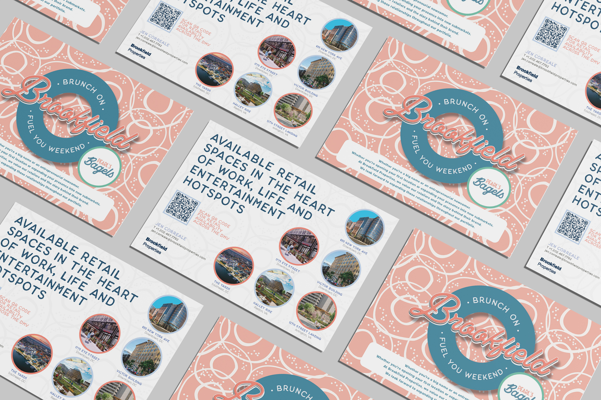
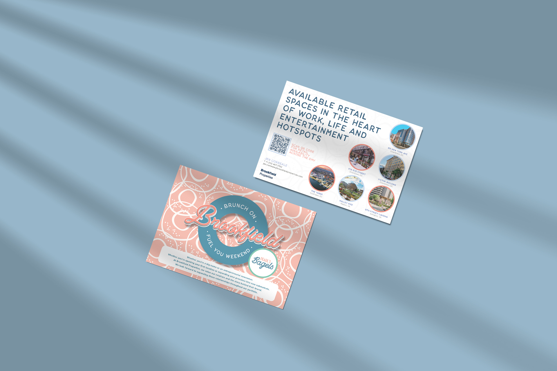
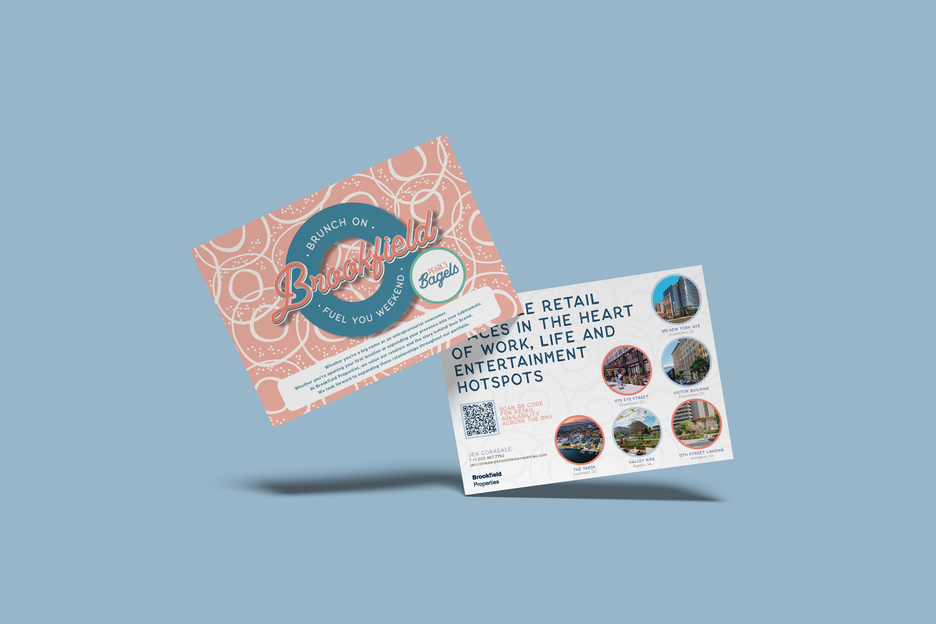
This project began as a simple idea and evolved into a tactile experiment in visual logic, materials, and playful brand expression. Designed as a small, unexpected gift for tenants at 655 New York Ave (DC), the piece celebrated weekend rituals, local flavor, and the joy of good design you can literally feel.
More than a marketing asset, it became a hands-on exploration of how color, typography, texture, and light interact, both digitally and in print.
Description & Defining
Challenge
Create something small, joyful, and memorable; without over-explaining it.”
The goal wasn’t to sell, inform, or direct. It was delightful. To transform a simple printed card into a sensory moment that felt crafted, warm, and human, while still aligning with Brookfield’s visual standards and Pearl’s playful personality.
The Experiment
This project became a controlled playground for materials and effects.”
UV finishes layered to catch light at different angles
Textured paper stock to add physical depth and tactility
Custom shadows built in Photoshop and Illustrator to exaggerate dimensionality
Color exploration inspired by food, mornings, and soft urban light
Typography treated as an object—not just text—stacked, offset, and given weight
The design intentionally blurred the line between print and digital, making flat assets feel dimensional and almost touchable.
The Result
What started as a tenant gift became a proof point: Material exploration and visual experimentation still matter.
A small-format piece that punched above its weight.
A tactile print experience that invited interaction
A playful brand moment that felt personal, not corporate
A physical object that people actually wanted to keep
A reminder that experimentation, when intentional, creates emotional connection
Takeaway
Not every project needs to be big to be meaningful.”
Sometimes the most memorable work comes from curiosity, craft, and a willingness to play.
And yes—UV ink, shadows, and paper texture can absolutely be part of the storytelling.